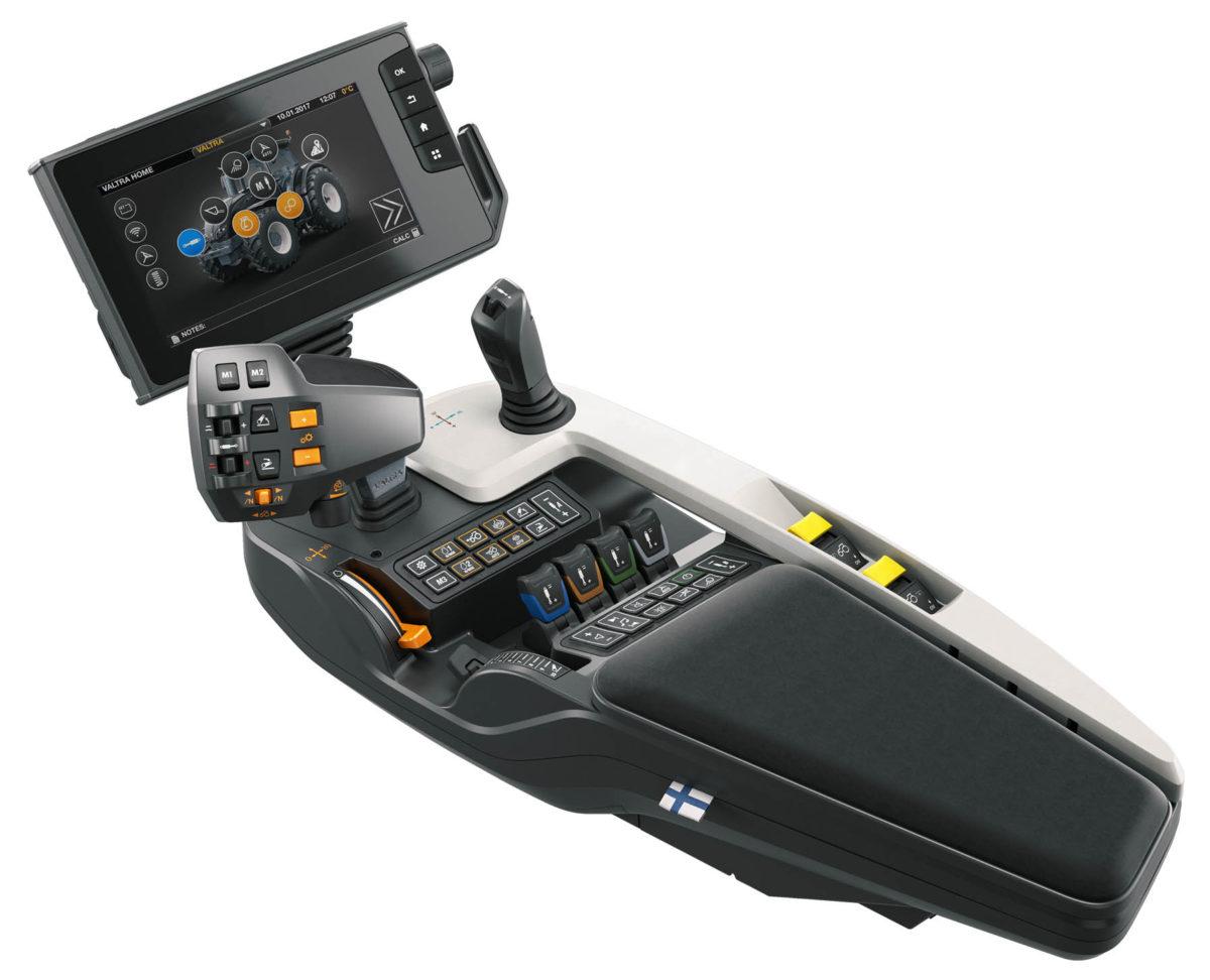
Development work on the SmartTouch user interface began already in 2008 with the aim of making it the best in the world. The development team began by looking into what competitors had done and came to the conclusion that they did not want anything like that. They then looked into phones and cars, but their intended uses were too different. Eventually, the best ideas came from customers. The SmartTouch user interface was tested among customers countless times in all phases of development.
“I was a designer with the cab team at the Valtra Engineering Centre when the iPhone was unveiled in the summer of 2007. It made me think about what kind of a user interface tractors should have. In autumn 2008 I made a demo on a Nokia E61 mobile phone that had the same kind of rotating tractor that is now on the SmartTouch home screen,” remembers Tuomas Nevaranta, Director, Product Management.
The rotating tractor image was a key insight for keeping the structure of the directory as simple as possible. Competitors were using up to 11 layers in their own directory structures. Nevaranta and his team believed that the tractor operator should be able to access
anything with just two taps. This was made possible by positioning the icons on the home screen on top of the rotating tractor in their corresponding places.
One step less – design principle
“Both we and our competitors have great features on our tractors that many customers have not learnt to use. When working with tractors, operators have lots more to do than browse through menus and wonder about symbols. We wanted to make using tractors so easy that all the great features would actually get used.”The icons were added to the user interface in 2010, the four quadrants in 2012, the profiles in 2013 and the drive lever in 2014. At times the team got carried away and added too many features, which were subsequently eliminated. The project was officially established only in 2012, before which the user interface was developed by a team of five or six employees on their own initiative.
“Two years before the launch, we found out that the armrest had to be made thinner and lower by five centimetres, so we stuck it in a band saw.”“The project demonstrated the power of teamwork. We all shared the same goal of creating the world’s best user interface, so our software developers, designers, engineers and everyone else genuinely worked for the good of the customer. The finest moment in my career and for the entire team was when SmartTouch was unveiled in Holland in 2017. By that time, it had become the joint project of the entire organisation.”
SmartTouch was tested countless times throughout the various project phases by 200 customers who had signed non-disclosure agreements. Listening to customers helped create the best user interface in the industry.
Starting in April 2012, over 50 different versions of the SmartTouch interface were developed.
Eye tracking cameras and customer tasks
Developing the world’s best user interface for tractors demanded a huge amount of customer testing. Altogether 200 customers signed non-disclosure agreements in order to test every detail of the user interface and the system as a whole countless times throughout the various project phases.“None of us had any experience in designing the user interface of a touchscreen. It was probably lucky, because it made us all so humble in front of customer feedback. Even if a certain function seemed so obvious to its designer, if customers didn’t know how to use it during testing, it was rejected immediately.”
In a typical test situation, customers were given a general task, such as, “Adjust the tractor as if you were about to start ploughing.” Customers were never given any help if they got into trouble. The customers were videoed and their eye movements tracked using special cameras.
Afterwards, they were asked for their opinions.
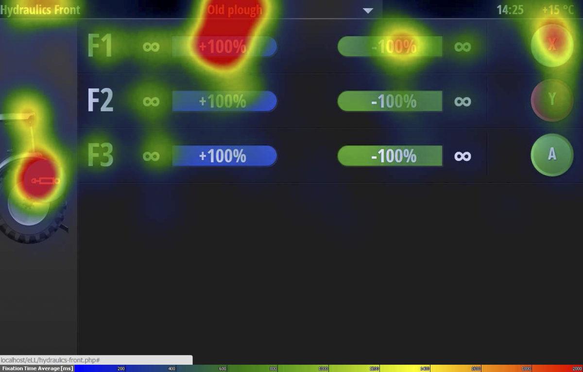
The eye movements of testers were tracked while using SmartTouch using special cameras, allowing developers to see whether users found the functions they were looking for and understood the icons.
“There were situations, for example, in which all the customers had spent a lot of time staring at a certain icon without ever “finding” the actual function. In other words, the icon was unclear.”
The customers comprised a wide range of farmers. One had never in his life used a touchscreen, so his experiences were obviously very instructive for the team. There were customers with small farms who drove Ford tractors from the 1970s, as well as customers with large farms who had all the latest equipment by different brands.
“When designing a user interface, the most important thing is the basic idea and the logic of use. It can then be expanded for different applications and functions. Impressive graphics simply support the logic of use.”
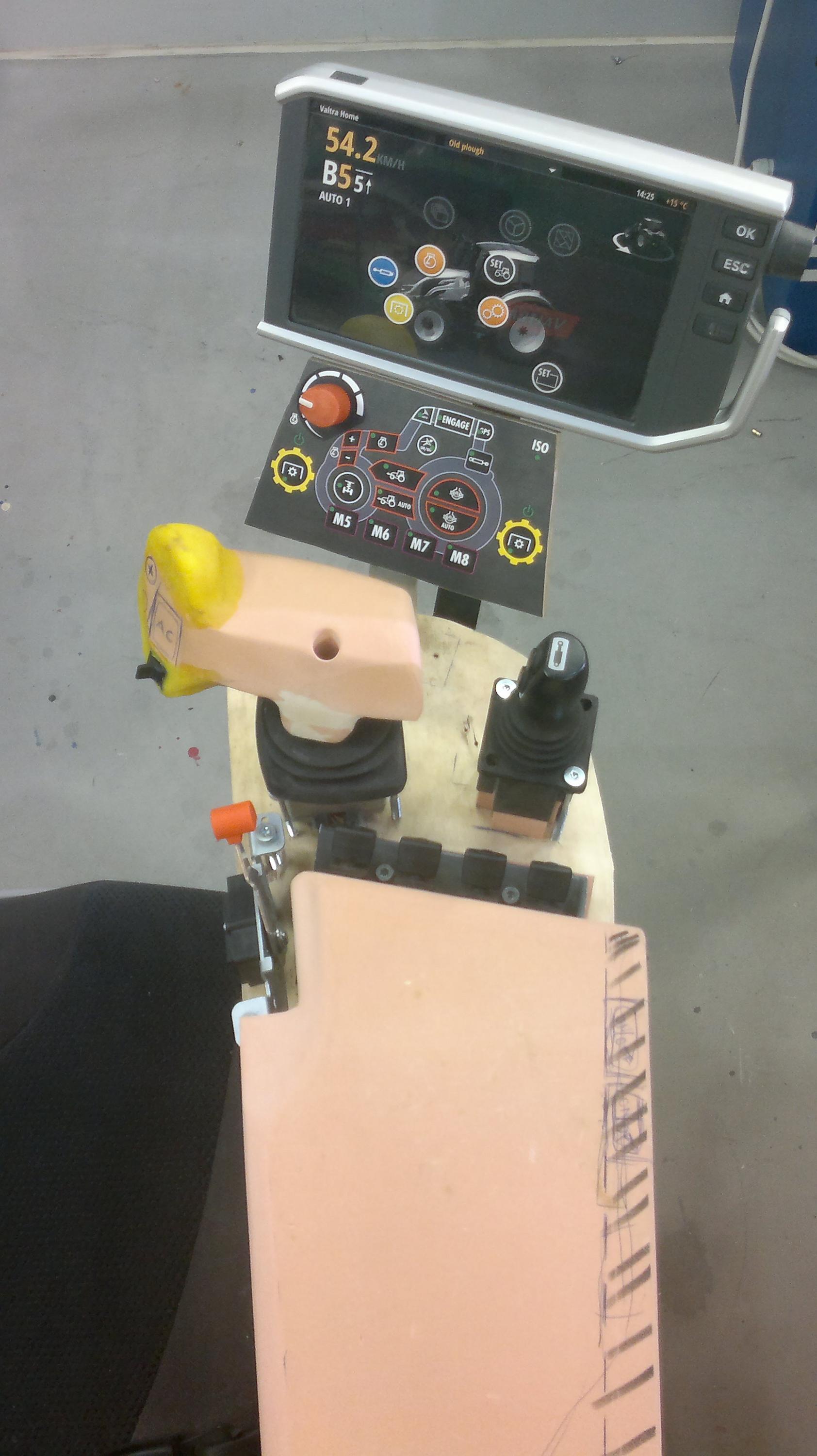
Redesigning with a band saw
Not everything went smoothly.“Around two years before launch, my supervisor asked how the project was going. I told him that everything seemed to be going well. A couple of hours later, we realised that the armrest was five centimetres too wide and high, so it wouldn’t fit inside the cab. We then had to take a band saw to our design mock-up and redesign it like that. We told ourselves to keep going, that we were still going to design the world’s best user interface on schedule.”
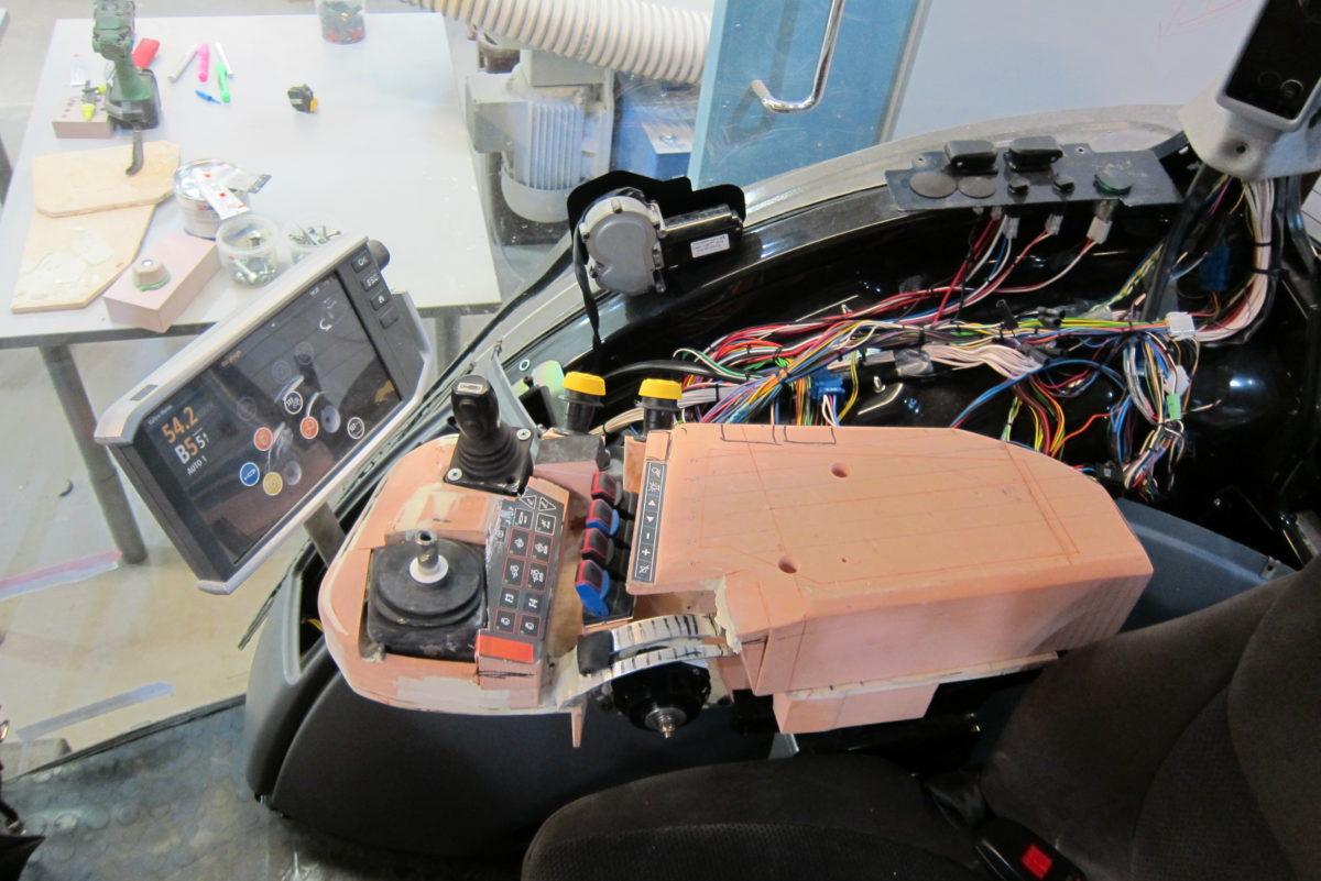
CAD modelling facilitates the design process, but physical models are also needed.
At that stage, the armrest was already a working prototype, and the idea was to simply work on the details. The designers and subcontractors were rather quiet when they saw how the mock-up had been cut by the band saw, Nevaranta remembers.
When selecting all the components and materials, the terminal and armrest were again subjected to various tests. For example, the terminal was tested in the cold lab at the Valtra
Research Department in Suolahti at minus 35 degrees Celsius, and it still worked fine.